A new, MySpace-esque social media platform has burst onto the scene, and it shot straight to the top of the iOS App Store on July 4.
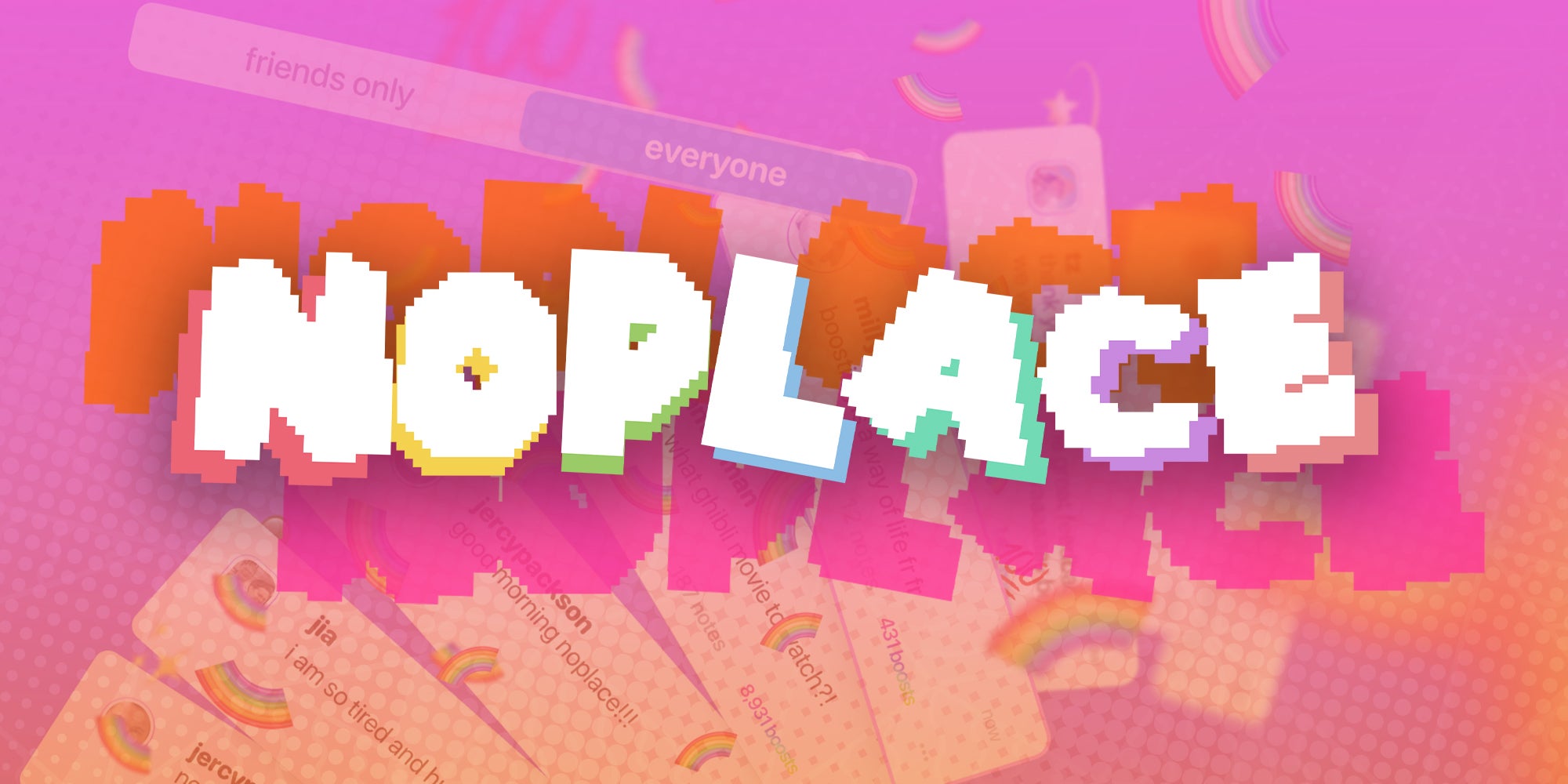
Noplace, a colorful, text-based social media app, is taking off after it launched out of invite-only mode last Wednesday, July 3.
For Tiffany Zhong, CEO and founder, it’s all about bringing the “magic” back to social media.
“I think that part of the magical, fun part of the internet is gone now,” Zhong said in an interview with TechCrunch. “Everything is very uniform.”
How does the noplace app work?
Noplace is designed for friends to share updates about what they’re doing, watching, or listening to, amongst other things. The app is very much focused on the present. It’s somewhere between the golden age of Facebook status updates and MySpace.
Users have the ability to list their top ten friends, share their interests via tags known as “stars,” and customize their user interface with a menagerie of colors.
Furthermore, the app has no “follower” counts, instead focusing only on “friends.”
While the app offers two different feeds — one with everyone and one with friends — it eschews algorithms in favor of AI-generated search summaries.
“Having a global, public feed is what makes it so fun. It’s like everyone’s brain on paper,” Zhong added. “People have a blast. They’re like, ‘I’ve never had an app like this before.’”
Based on the app’s description, it’s definitely tailored to a Gen Z audience. It calls for “NPCs, main characters, swifties, barbs, nerds, and stans” to join their ranks.
But if you’re not an iPhone user, you might have to wait a little bit longer, as an Android version of the app isn’t available just yet.
It’s unclear how exactly monetization will fit into the noplace ecosystem long term, particularly for career creators. But for now, this app feels like an antidote to the perfectly-curated feeds of Instagram, YouTube, and even, to an extent, TikTok.
“Everything is just media,” Zhong said. “It feels very disconnected.”

